07740 877 544
If you’re interested in gaining an understanding of how to hand letter a sign, then this article is for you. The guide is packed with photos of how to transfer a design to multiple panels for lettering. As well as the numerous stages of building layers for painted lettering and images. The process is full of useful tips which can be applied to your own designs.
What is traditional hand lettering?
Traditional hand lettering or signwriting is the craft of brush painting letterforms and ornamental images. Since Roman times, letters were painted to display information for public viewing. Painted letters are used for advertising and wayfinding as well as adding character to lettering design. Traditional hand lettering can be as simple or elaborate as the signwriter chooses and includes many differing styles.
Hand lettering materials
In most circumstances, materials required for hand lettering sign panels are:
- Your panel – smooth painted or coated
- Signwriting enamels
- Signwriters’ brushes
- Mahl stick (optional)
- One inch (25mm) masking tape
- Thinners and brush cleaners
- Paint pots, stirrers, lint-free cloths
- Ballpoint pen or soft lead pencil
- White chalk (for dark backgrounds)
- Tracing paper (optional but advised)
- Fine line adhesive tape (optional)
- Stabilo pencil / crayon pencil (optional)
To begin, you need to have something to say so that you can paint it.
The transfer process
For single signs, beginners are advised to practice drawing their message before transferring directly onto the panel. This avoids any unforeseen issues with size or legibility and prevents multiple attempts and erasing.
For more than one sign displaying the same message and design, a transfer pattern is the most efficient method. There are options for transferring lettering drawings to multiple panels and for this process, a tracing paper pattern will be used. Tracing paper allows the signwriter to draw the design onto paper first, before making any necessary adjustments. Following any adjustments, the lettering and/or design can then be traced at full scale, before transferring to one or multiple panels.
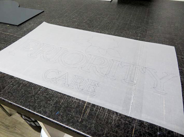
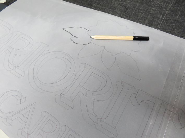
The wireframe lettering design is drawn onto tracing paper at the scaled size for the panel. You can colour the design if desired, which may make it easier to visualise on your panel.
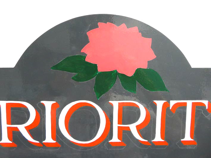
The pencil line drawing comprises my message and the background shape of an accompanying flower image.
Place the pattern on top of your panel and move it into position. Using masking tape (or sticky tape), tack the corners of the tracing paper onto the panel surface.
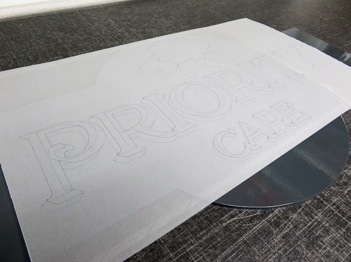
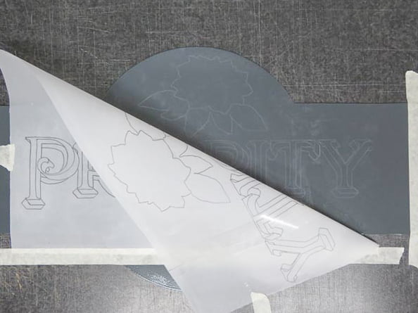
Make a hinge on one side of the tracing paper by masking a line of tape down or across the tracing paper’s edge. This should be even and tight, like the spine of an open book.
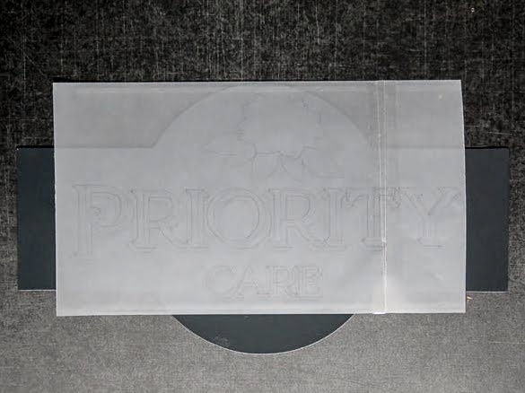
Turn the ‘page’ of the tracing paper so that the lined drawing is now face down on the surface, with the taped spine still adhered to the panel and/or surface.
The relief drawing
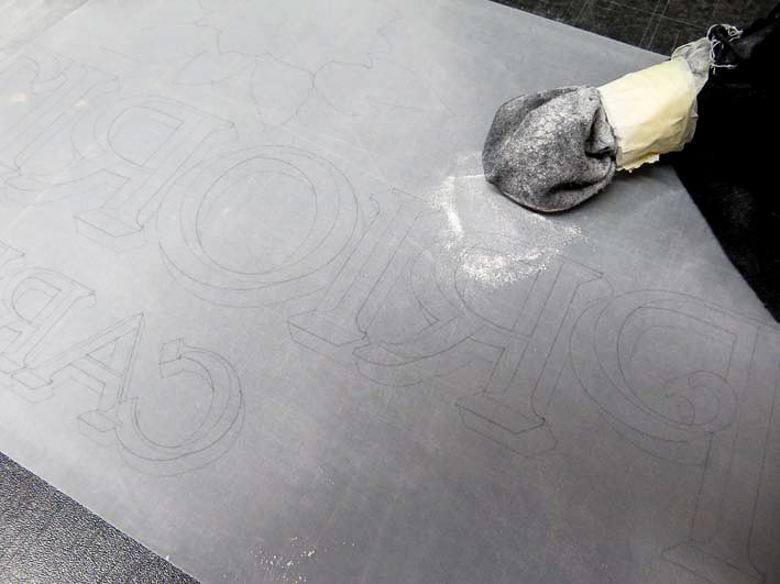
With chalk (I’m using white chalk powder wrapped inside a cloth), rub the back of the lined drawing so that the entire pencil drawing is covered in chalk. Choose coloured chalk that will be visible on the background colour of your panel. Rub gently with your fingers so that there aren’t masses of chalk or powder on the drawing, as this will create smudges when you transfer the design.
Turn the tracing pattern back over so that the design is now face up. The use of a taped ‘spine’ is helpful for accurate positioning.
Using a pen or pencil, begin to draw on top of your design. Don’t press too hard, to begin with.
Once you’ve drawn a segment of your design onto the face of the tracing paper, lift a corner and take a peek.
Now you can see the relief drawing transferred to the panel. If it is too light or invisible, turn back over and press harder on the tracing paper drawing.
Avoid pressing so hard as not to mark or score the panel face.
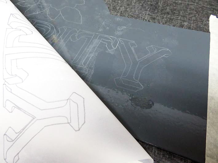
Rubbing gently on the tracing paper after you have chalked the back, reduces the amount of chalk on the paper, thus reducing smudges. Try not to lean your hands too much on the tracing paper to prevent smudges pressed through onto the panel.
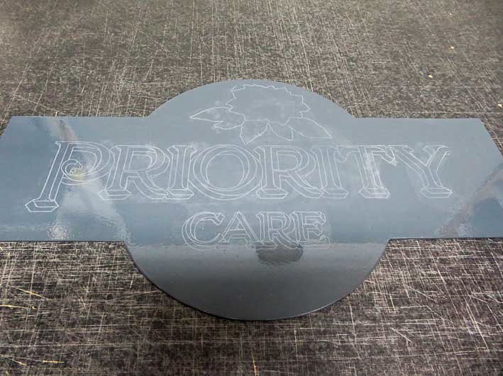
Once the entire design has been traced and you have lifted the corners to check that the transferred drawing is visible, remove the tracing paper completely.
The painting process
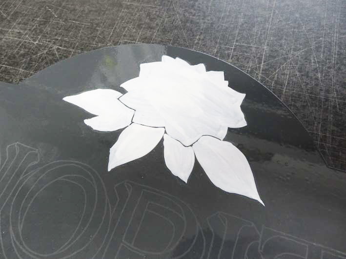
Due to the dark grey background, I’ve chosen to use a base coat of white first. This helps block out the dark background bleeding through any light colours. It also minimises several coats of any light coloured paints on top of the dark background.
Using basic brush painting, fill in any masses of coloured areas first. The detailing will come later.
I expect this sign to last for years in exterior conditions, so I’m using signwriting enamel which is an oil based, gloss paint.
Enamels can be slow drying and as such, I alternate painting between different areas of the design. By planning what I will paint first, allows me to fill in as many areas as possible without stalling myself. I consider which areas may be problematic for reaching when the paint is wet, so I divide my design into manageable segments.
I’ve chosen to begin with the base coat of the flower image before filling in the block shadow. I can then go back to the flower if the base coat is dry after I paint the shadow and lettering.
The lettering process
This is an awkward shape of a panel for leveling, so I’ve used two inch masking tape to stick it to my easel.
Make sure that you have the panel at a comfortable height for working on. If you prefer to paint the panel on a flat surface, keep standing it upright to check that the brush strokes are how you want them to be.

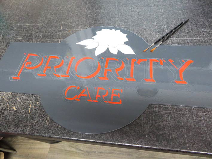
The lettering will be finished in a pale grey so two coats are required to make the colour solid on the dark background.
I now return to the flower and fill in the colours.
The colours are still not solid after one coat so building up coats will add time to the overall project. Again, plan what can be painted and alternate the areas you are painting when each coat is drying.
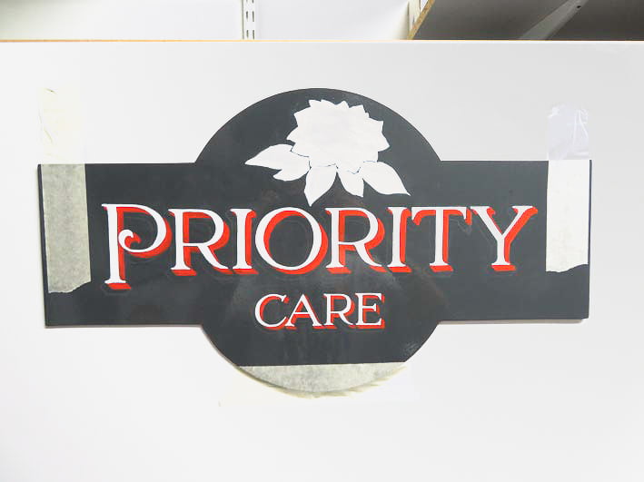
Detailing

I want to add dimension to the shadow so I lighten and darken the main shadow colour, before dividing the shadow into where I think the direction of the light angle will be.
At this stage, I’m not too concerned with accuracy as I know that there will be several more coats on top of the initial coats.
By blending and fading the shadow colours into the base red colour, a gradient effect begins to appear. The softening of the added colours’ edges helps the shadow to look dimensional.
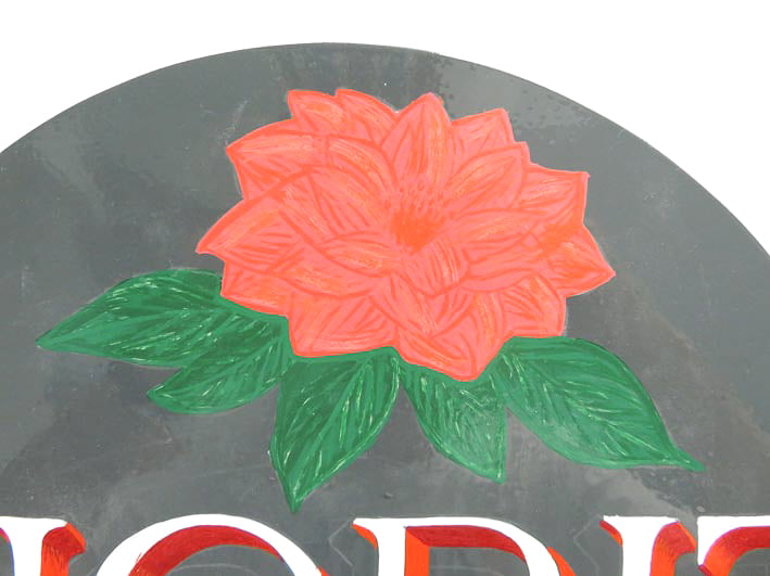
Returning to the flower, I can now add details in different colours. The building up of the layers of detail colours helps with the opacity of the image. So that the image now becomes more solid on the dark grey background.
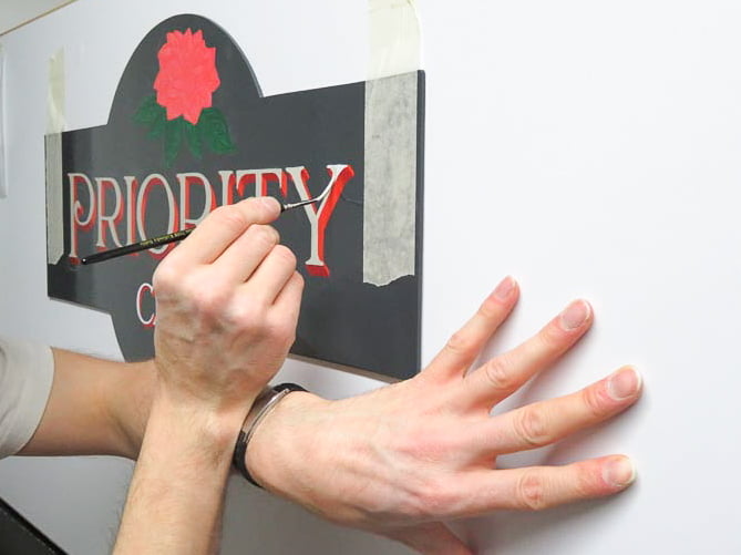
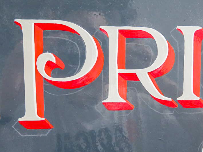
I can now paint the pale grey main colour of the lettering. I’m using my left arm (as I’m right-handed) to rest my writing hand whilst lettering.
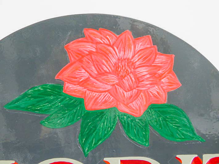
Adding highlights and shading to the leaves and petals.
Keep your paint workable
I try to keep the enamels thin and workable by occasionally adding thinners to the brush and/or the paint. Dependent on the temperature of the working environment as well as the paint, regular thinning will help prevent the paint from becoming too thick and unworkable.
The lettering enamel on your brush should be free flowing and slightly elastic. If you feel that the paint is dragging or that the brush is hardening, thin the enamel.
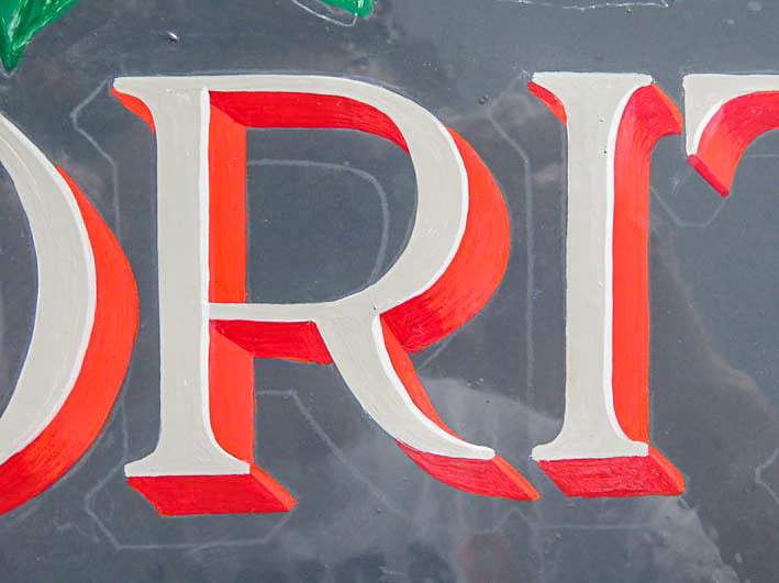
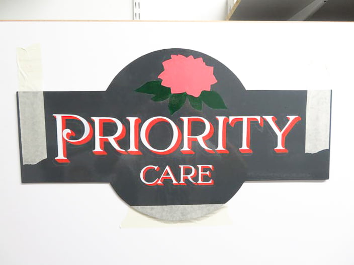
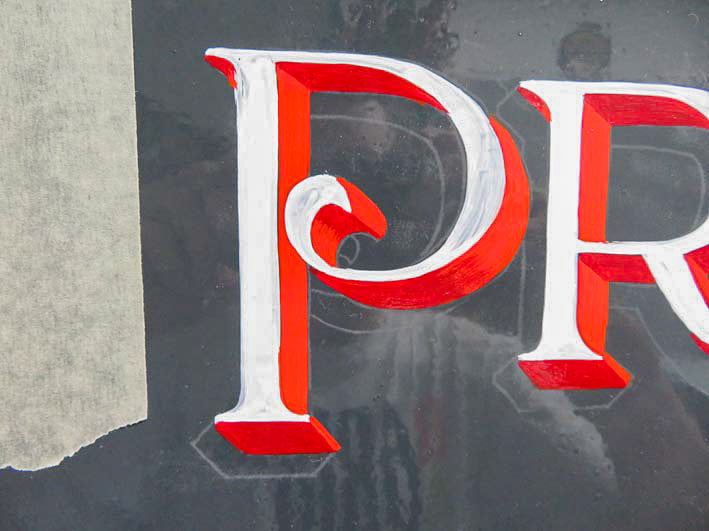
I now add a highlight inline to the pale grey lettering. Not too prominent but a small detail to add a highlight.
I also begin to overcoat any see-through colours and tidy up the edges of the lettering and shadow.
The lighter that the background colour is, the less overcoating will be required (if at all). Choosing the correct, quality paints for the project also saves a considerable amount of time.
Shadowing letters

Now I can begin adding further dimension with a drop shadow. Continue to stand back and check that the design is piecing together the way you want it. Take time to consider and ensure that the light angle for the shadows is consistent throughout the overall design.

This will make the lettering pop off the background even more. Choosing a darker shade of the background colour for the drop shadow helps with a more natural and realistic effect.
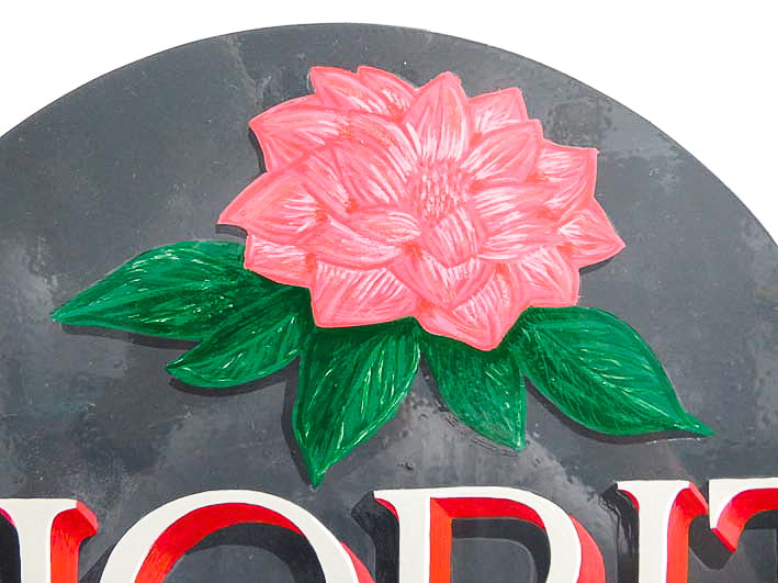
The underside of the leaves and petals can also be given a matching shadow which immediately provides depth to the image. As well as stitching the image and lettering together in style.
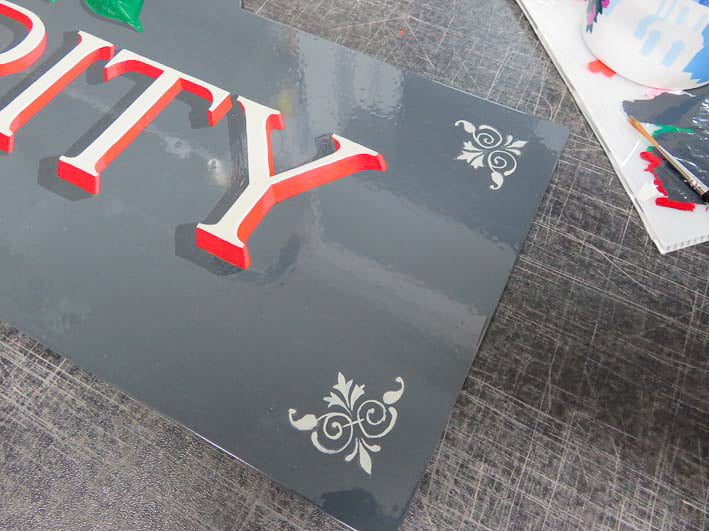
When designing the sign, I always knew that I wanted an inline around the perimeter edge. In keeping with the vintage style of the design, I chose a corner ornament that would complement the overall appearance.
You can find tons of inspiration from letterheadfonts.com for this style of design. The lettering style used in this design was also modified from a letterheadfonts.com font: LHF Confection Deco Caps.
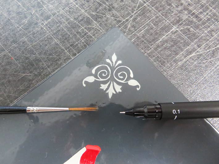
I used the smallest writing brush in my toolkit but even this was slightly too large. Small craft brushes with shorter hairs would be ideal for very fine and tiny details.
Lining the sign
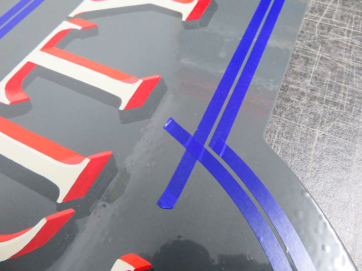
For accuracy, I use 3M fine line tape for thin and clean lines. The blue tape is easily applied to curves and does not lift or curl. A lining brush can be used to achieve thin painted lines, but I would have struggled on the curved edges. I wanted this inline to be straight and sharp so that the overall design wouldn’t appear wonky.
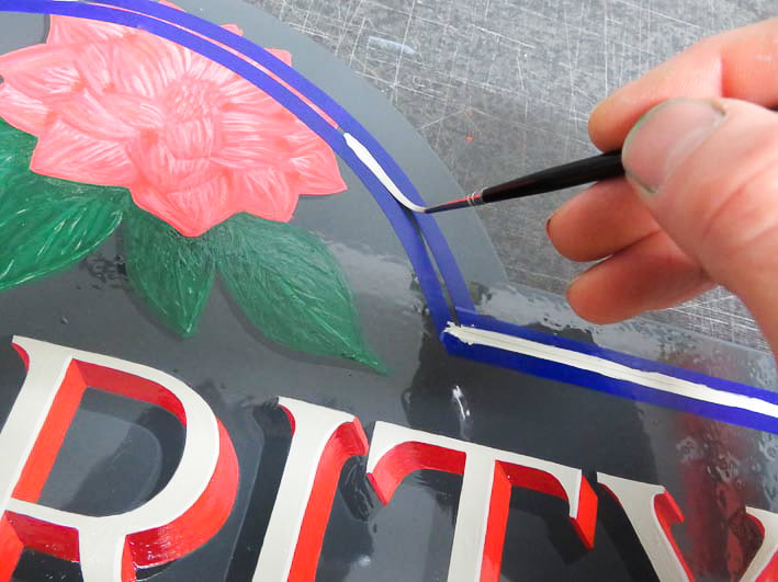
Painting between the taped lines with the pale grey enamel. I stop equally short of the flower image and corner ornaments.
The varnishing process

Once the tape is removed and I’m confident that the paint has hardened, I gently clean the sign face with isopropyl alcohol. This removes any remaining chalk dust and degreases the surface of any contaminants like thinners or oils from my hands.
Now I can varnish the sign for extra depth and durability.
The varnish is not essential, especially if you are using decent quality lettering enamels and suitable panel substrates. It will however protect the enamels in exterior conditions.
In years to come, the faded sign can be cleaned, sanded, and varnished again to rejuvenate the colour brilliance without re-lettering.
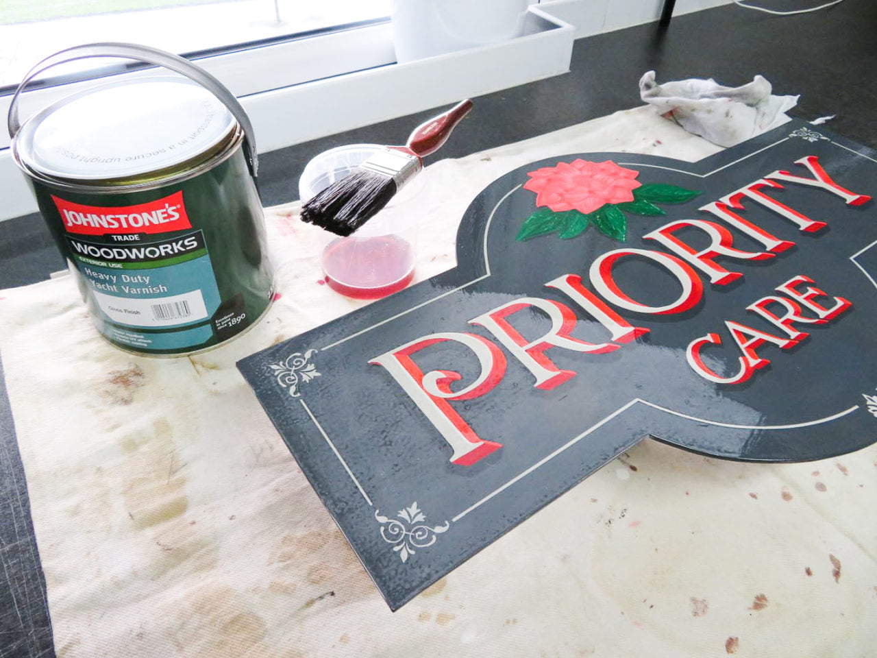
Using yacht varnish which is a gloss finish, I paint two coats on the sign face. Although there is a yellowing caused by the pigment in the varnish, I’m not concerned that this will affect the colouration of the design. In this case, the warm, yellowing layer enhanced the vivid reds and pink.
Most colours, especially whites, will be discoloured with a top coat of varnish. It’s advisable to not varnish white backgrounds to avoid yellowing.
It’s always sensible to test any varnishes or lacquers before painting directly onto your finished sign.
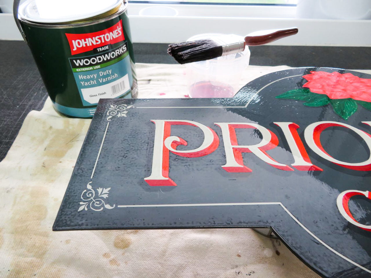
I also flatten the sign face with fine sandpaper: 320 grit for this panel and only after the first coat of varnish.
Do not sand the panel before coating the panel with varnish!
Time to admire and photograph
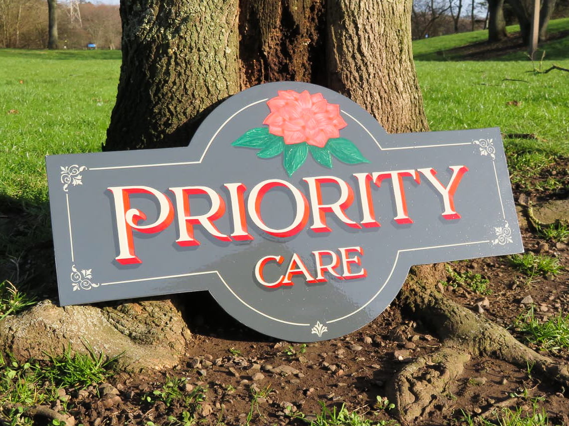
Finally, I choose a suitable tree to lean the sign against and take photographs in the sun.
Keep a record of your projects and you’ll see improvements through practice.

Key points
- Practice drawing your design onto paper before transferring onto the panel
- Use tracing paper transfers for identical, multiple signs
- Don’t press too hard when transferring the design onto the panel
- Plan and divide the route in which you will paint each segment
- Use enamels and thin the paints
- Consider using fine line tapes for accuracy
- Varnishes and lacquers can discolour paints
- Do not sand the panel before varnishing or lacquering
The reward of creating a sign by hand lettering will inspire you to do more.
Thanks for reading.